
Previously, in one of my projects in the MUXD programme, we were given a task about voting and chose Policy.nz as our subject. My team and I were in the same group, and we divided our project into two parts, which are user research and user design. We picked the Policy.nz, a one-stop hub platform that gathers detailed information about the political parties, candidates and the policies in New Zealand. Their aim for this platform is to help the voters to make an informed vote for the elections. This platform typically summarises critical policies, candidates' profiles, and comparisons between topics to enhance voter engagement and help you decide who to vote for.

So, the primary purpose of this prototype was to declutter the unnecessary interface, reduce the number of steps, and speed up the interaction for inexperienced and experienced users. Within the timeframe given, the outcome of this case study would be improvement steps in comparing candidates and policy along with the prototype presented in this case.
The Challenges
The challenges in this project were the comparison tool we suggested, where many steps were taken, and the visual I suggested previously needed to be more harmonious to fit the brand. Let's dig into the section where we need to understand why I intended to rework this project.
Most of the platforms are already catering to two user types, which are inexperienced and experienced users, and they typically adopt:
1. IA Principle - Choices of the user: Allowing seamless and lesser-step use of the platform without disrupting the user's choices. For example, users can easily create a Facebook account using the email shortcut from the user's phone.
2. Design Heuristic - Reduce the cognitive loads for all:
Strive to eliminate the redundant or overused images in the platform. For example, Uber avoids visual clutter by using simple icons and tabs so that the user can transition to ride and food delivery services at the same time.
Let's briefly go into the two iterations based on the challenges above.

Part 1: Reducing the steps in information architecture.
Initially, I developed a simple information architecture based on the IA principle, which lets the user choose with fewer steps and go directly to the page comparison tool.

I was instantly enthusiastic about this idea for several reasons:
1. Users are guided and solely concentrate on their actions when choosing their preferred candidates or policies.
2. Users are shielded from any irrelevant information that can be removed from the initial information architecture, which can speed up their actions when using the tools.
3. Some may argue that I took out the 'preferred project', but the wise Dan Brown once mentioned that "more options means more cognitive effort and more effort can sometimes mean more anxiety", which makes sense for me to remove it and as voters, providing a long list of information of preferred project can be overwhelmed and voters can find the project in the right channel such as Wellington City council website would benefit for those who interested.
Part 2: Declutter and adjusting the layout and the visual in prototype.
This is how it previously it look with the layout and visual before iteration.


Before make it the final prototype, I dawned into it and it soon became clear to me that something was missing in the pages above, so that's the moment that some visual support could be offered:
1. Changes of colour from bold to subtle colour to soothe and make it easier for the eye to skim the information.
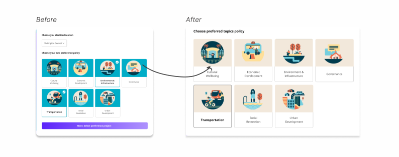
2. The layout on this page has also been adjusted has more white space

3. Adding an option for users to compare the candidates or topics on the same page back and forth plus less hassle for users to find the information when the option is on the same page.

To wrap up this Policy.nz design case study, here are some important conclusions from the iterations I've done:
1. Reduce the amount of work for users while considering the design's inherent complexity.
2. Remove unnecessary elements that distract users from their tasks.
3. The resilient to continue to iterate the product until the product serves the users.
4. There is undoubtedly still plenty to learn and develop in this project can be done when testing with the real user.

